Results and discussion
Vegetation cover analysis: Figure 4 depicts NDVI computed temporally (1980-2010) and Table 5 indicates the temporal NDVI values, highlighting the decline of area under vegetation from 36% (in 1980) to 13% (in 2010). Land use analyses were done to understand the class (urban, vegetation, water bodies, others) distribution temporally.
Land use Analysis: Preprocessed data of all temporal periods were classified using Gaussian maximum likelihood classifier as discussed in methods section and given in Figure 5. Accuracy assessment of the classified images was performed using the error matrix and kappa statistics (using the module r.kappa in GRASS). Table 6 tabulates land use statistics of classified images and table 7 tabulates the results of accuracy assessment. Land use analysis reveals an increase in urban area from 2 % (in 1980) to 8.6% (in 2010) with a decline of vegetation from 33.6 % (in 1980) to 7.36% (in 2010) and a significant increase in ‘others’ category (which includes degraded forest land, open area and cultivation land).
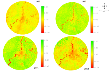
Figure 4: Vegetation cover (NDVI) in the study region
|
Vegetation (%) |
Non- vegetation (%) |
1980 |
35.68 |
64.24 |
1990 |
29.37 |
70.5 |
1999 |
25.16 |
73.26 |
2010 |
13.14 |
86.86 |
Table 5: Results quantified for the study region
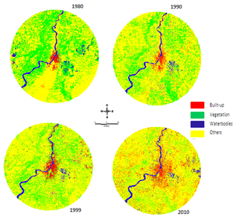
Figure 5: Temporal land uses in Kolkata
Land Use category |
Built-up |
Vegetation |
Water body |
Others |
Year |
Area (sq.km.) |
Area (%) |
Area (sq.km.) |
Area (%) |
Area (sq.km.) |
Area (%) |
Area (sq.km.) |
Area (%) |
1980
1990
1999
2010 |
72.66
79.27
132.4
314.3 |
2.0
2.2
3.6
8.6 |
1222.9
852.7
740.8
268.1 |
33.6
23.4
20.3
7.36 |
102.8
103.5
97.2
114.6 |
2.83
2.84
2.67
3.15 |
2240.2
2608.5
2666.2
2947.3 |
61.5
71.5
73.32
80.87 |
Table 6: Land use changes during 1980 to 2010
Kolkata |
1980 |
1990 |
1998 |
2010 |
OA |

|
OA |

|
OA |

|
OA |

|
99 |
0.0144 |
88 |
0.9495 |
93 |
0.9687 |
93 |
0.9922 |
Table 7: Overall Accuracy and kappa statistics of classified data
Figure 6 illustrates the pattern of urbanization and sprawl in the study region (Kolkata with buffer), and land uses at local levels is (gradient wise) depicted in Figure 7, which highlights an increase in built-up areas in NE and SE directions with declining vegetation cover.
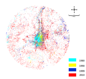
Figure 6: Kolkata’s urbanization process during 1980- 2010
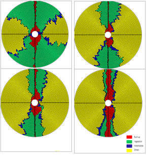
Figure 7: Circle-wise land use (X-axis – Gradients @ 1km, Y axis- metric value)
Shannon’s Entropy (Hn): Shannon’s entropy, an indicator of sprawl (Table 8, Figure 8) highlights that the land use is fragmented in all directions due to emergence of new urban pockets with time. Concentrated growth is observed at the city’s centre. Figure 8 highlights an increase of entropy values during the last three decades, indicating the tendency of sprawl that demands appropriate policy interventions for the provision of basic amenities.
|
NE |
NW |
SE |
SW |
Reference Value |
1980 |
0.04 |
0.03 |
0.05 |
0.06 |
1.53 |
1990 |
0.11 |
0.02 |
0.09 |
0.05 |
1999 |
0.19 |
0.03 |
0.13 |
0.07 |
2010 |
0.3 |
0.16 |
0.28 |
0.21 |
Table 8: Shannon’s entropy
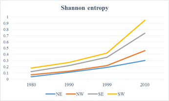
Figure 8: Shannon’s Entropy - 1980 to 2010.
Landscape metrics analysis: These metrics quantify spatial characteristics of patches, classes of patches, or entire landscape mosaics. These are quantitative measures of landscape composition that considers the proportion of a landscape in each class depending on patch type, patch richness, patch evenness, and patch diversity. Gradient based metrics’ analyses illustrate the urban structure with spatial patterns based on fragmentation, shape, edge, and contagion metrics.
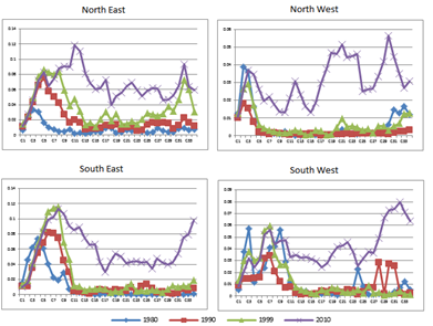
Figure 9a: Percentage of urban landscape
-
Number of patches (NP): NP calculates the number of built up patches in terms of hectares in a given landscape. It is considered an indicator of the level of fragmentation in a particular class in the landscape. The results (Fig. 9b) of the analyses show an increasing number of urban patches towards the city fringes and peri-urban areas, exhibiting fragmented urban growth in those regions. The city’s center has almost reduced to a single urban patch without any other dominating land uses in 2010. Fragmented growth in peri-urban areas has increased in 2010. This metric is in conformity with Shannon’s entropy values illustrating sprawl.
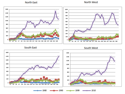
Figure 9b: Number of urban patches in the landscape
-
Patch density (PD): PD analyses the urban patches, which, as given in Fig 9c, show an increasing urban patch density near the fringes and peri-urban areas, whereas it has lower values in the city center. This is comparable to NP that indicates peri-urban areas getting fragmented with sprawl by 2010.
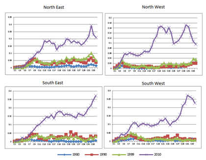
Figure 9c: Patch density of urban class in the landscape
-
Area weighted mean shape index (AWMSI): This metric was computed in which average shape index of patches was weighted by patch areas. It is a robust metric used to describe landscape structure across spatial scales by calculating the complexity of urban patches according to their size (Huang et al., 2009).Circles near to the city center show high values indicating complexity and irregular shapes (in all directions) by 2010 (Fig 9d.) as aggregated urban patches are weighed higher than smaller ones. Lower values in 1973 for core as well as buffer regions (peri-urban areas) indicate a mix of heterogeneous classes.
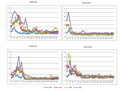
Figure 9d: Patch density of urban class in the landscape
-
Normalized landscape shape index (NLSI):This index explains the phenomena of aggregation or disaggregation through shapes, which means if the values are close to zero the land use is of a simple and compact shape, or otherwise, depending on complexity of the land use, the value increases with the maximum being 1. Figure 9e illustrates that the central patch is a simple shaped patch indicating aggregated growth, whereas the buffer regions and outskirts show values greater than 0.4 that indicate the presence of complex shaped land uses and disaggregated growth.
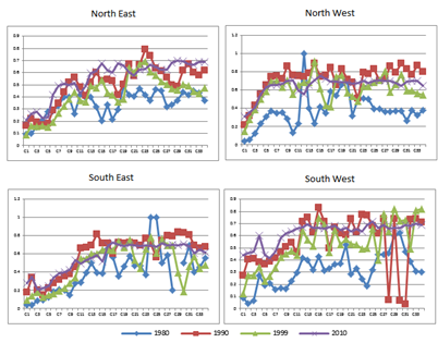
Figure 9e: Normalised landscape shape index
-
Edge density (ED): This refers to the ratio of total number of edges of all patches to total area, and it is the measure of fragmentation of the landscape. High ED values (Fig 9f) of 0.4 along the periphery indicates fragmentation, whereas the core area near the centre with relatively low values indicate clumped growth in accordance with other landscape metrics.
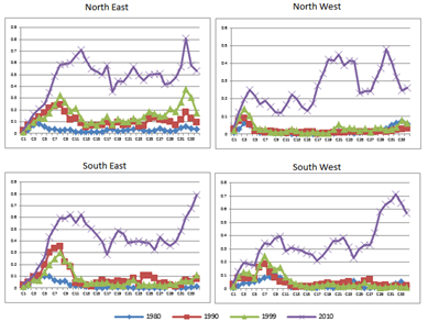
Figure 9f: Edge Density
-
Clumpiness index (CLUMPY): This is the measure of patch aggregation. Figure 9g shows a decreasing trend (mostly in 1989) with values closer to zero as urban patches are randomly distributed. Similarly, in 2010 the city centre has values close to 1 which indicate aggregated growth while values closer to zero in the buffer regions indicate fragmented growth.
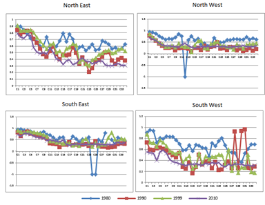
Figure 9g: Clumpiness Index
-
Interspersion and Juxtaposition index (IJI): The interspersion and juxtaposition index (IJI) measures the extents to which patch types are interspersed. Higher valued results (greater than 20) assert that the urban patch types are well interspersed (i.e., equally adjacent to each other), whereas lower values characterize landscapes whose patch types are poorly interspersed (i.e., disproportionate distribution of patch type adjacencies) (McGarigal and marks, 1995). The results (Fig 9h) also bring out the fact that there has been tremendous growth of urban patches in the outskirts and buffer regions in 2010, thereby indicating sprawl, while the central region showed clumped growth in 2010.
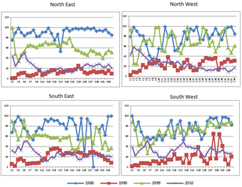
Figure 9h: IJI-Interspersion and Juxtaposition Index
-
Aggregation Index (AI): Aggregation Index gives a similar meaning to clumpiness index, wherein it measures the aggregation of urban patches. Figure 9i indicates that towards 2010 the aggregation happened at the center, while outskirts and the buffer regions were being fragmented as their number of patches increased as highlighted by other spatial metrics.
Figure 9i: Aggregation index